Post Featured Image Block
Use the Post Featured Image block to display the featured image of a post. This block is primarily nested inside a query loop block and helps to customize the appearance of the query loop.
To add a Post Featured Image block, click the Block Inserter icon when editing the page template. Search for the Post Featured Image block. Click on it to add the block to your page template.
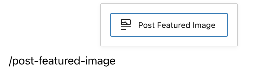
You can also type /post-featured-image and hit enter in a new paragraph block to add the Post Featured Image block quickly.


Detailed instructions on adding blocks can be found here.
Block Toolbar
To view the block toolbar, click on the block and the toolbar will be displayed.
Every block comes with unique toolbar icons. These block-specific controls allow you to manipulate the block right in the editor.
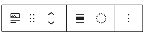
The Post Featured Image block shows six buttons in the block toolbar:
- Transform to
- Drag icon
- Move arrows
- Change alignment
- Apply duotone filter
- More options
Transform to:
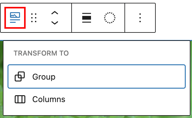
Click on the “Transform” button to convert the Post Featured Image block into a “Group” block or “Columns” block.
Drag icon:
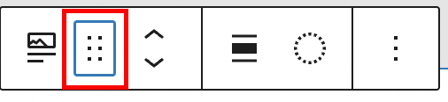
To drag and drop the block to a new location on the page template, click and hold the rectangle of dots, then drag to the new location. The blue separator line indicates where the block will be placed. Release the left mouse button when you find the new location to place the block.
Move arrows:
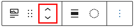
The up and down arrow icons can be used to move the block up and down on the page.
Detailed instructions on moving a block within the editor can be found here
Change alignment:
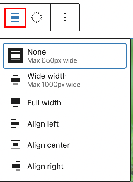
- None – Leaves the block the current size.
- Wide width – Increase the width of the block beyond the content size.
- Full width – Extend the block to cover the full width of the screen.
- Align left – Make the block left-aligned.
- Align center – Make the block center aligned.
- Align right – Make the block right aligned.
Apply duotone filter
You can create a two-tone color effect (called the duotone effect) on the featured image without actually changing the original image. The duotone effect works best on high-contrast images.
You can pick the two colors for the effect from the list of six duotone presets provided in the drop-down.
- Foreground and background
- Foreground and secondary
- Foreground and tertiary
- Primary and background
- Primary and secondary
- Primary and tertiary
These are based on the foreground, background, primary, secondary and tertiary colors set in the theme’s color palette.

You can also pick your own colors for the shadows and highlights by clicking on the Shadows /Highlights option which opens up the color picker and selecting your custom color from the color palette.
To clear all the changes you made, use the clear button at the bottom right corner.
More option
The More option on a block toolbar gives you more features to customize the block.
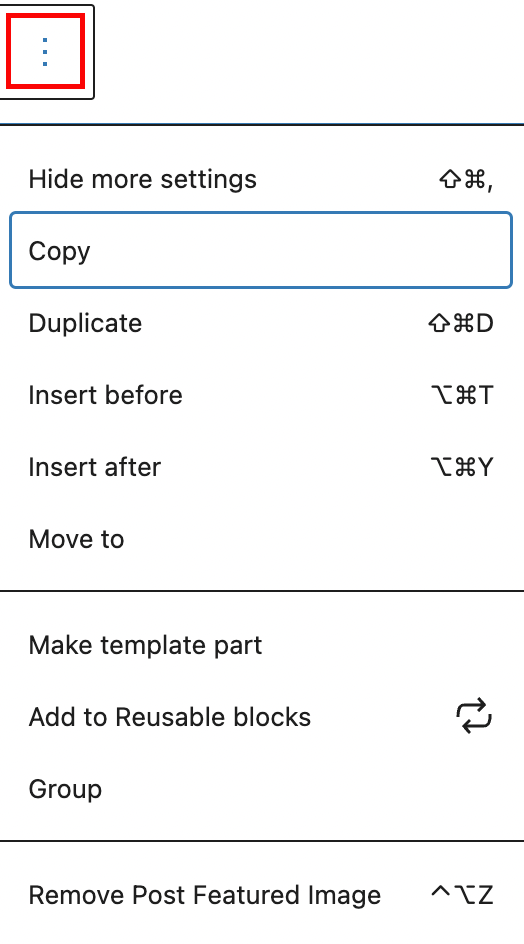
Show/Hide more settings
The (Show)Hide more settings option hides (or shows) the Block Setting panel in the editor’s sidebar.
Copy
Copy can be used to copy a selected block and then you can paste it wherever you want in the editor.
Duplicate
Duplicate can be used to duplicate selected block.
Insert before
Insert a new block before the selected block(s).
Insert after
Insert a new block after the selected block(s).
Move to
When you select Move To, a blue line will be displayed inside your content. You can then use the arrow keys to move the blue line up or down based on where you want the selected block to be moved into. Once the blue line is in the new location, hit ’Return’ on your keyboard. This will move the selected block to the new position.
Make template part
The Make template part option allows you to convert the selected block into a template part.
Add to Reusable blocks
The Add to Reusable blocks option lets you add the selected block to a list of reusable blocks, so you can use them on other pages.
Group
Select the Group option if you want to group multiple blocks into one unit. This option is useful if you want to add a background color to multiple blocks.
Remove Post Featured Image
With the Remove Post Featured Image option, you can delete the selected block from your page.
Click here to learn more about the More options.
Block Settings
In addition to the block toolbar, every block has specific options in the editor sidebar.
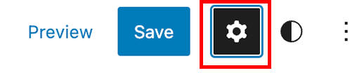
If you do not see the sidebar, click the ‘cog’ icon next to the Save button.

Link Settings:
Turn on the ‘Link to post’ button in the Block Settings to link the featured image to the URL of the post. This enables the website visitor to go to the post by clicking on the Featured image.

Dimensions Settings:
Click on the ‘+” icon to the right of Dimensions to explore the Dimensions Settings for the block.

Click on Margin and the Padding from the drop-down to display the Margin and Padding Dimension Settings for the Post Featured Image block.
The Margin setting affects the space around the selected block. You can type in a custom value in the text field if you want the same spacing all around the block.
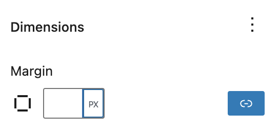
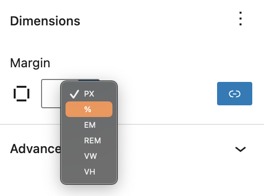
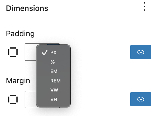
You can change the unit for Margin by clicking on PX to display a dropdown with the other supported units- %, EM, REM, VW, and VH.
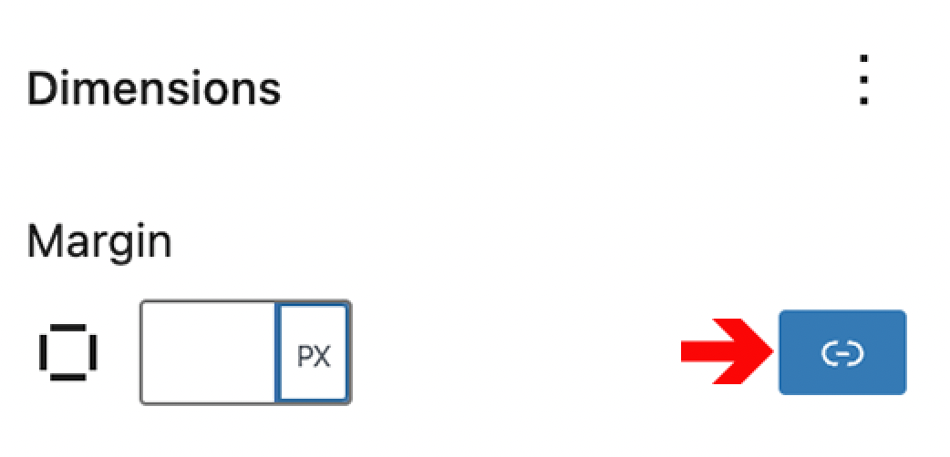
Click the Link icon to the right, to set different spacing values for top, right, bottom and left of the block.
You can type in a custom value in any of the four text fields. You can also change the unit for margin by clicking on PX to display a dropdown with the other supported units- %, EM, REM, VW, and VH.
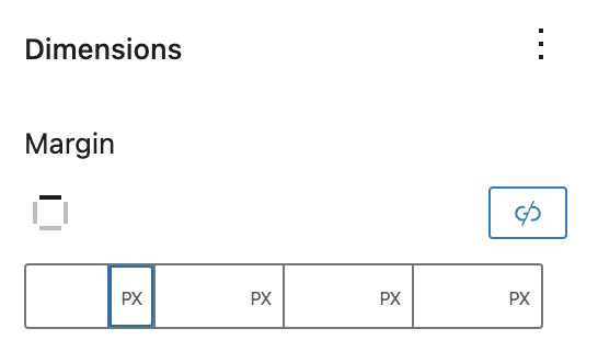
Click on the Link icon once again if you want to have the same value for margin all around the block.
The Padding setting affects the space between the block’s content and its border. You can type in a custom value in the text field if you want the same spacing for the padding.
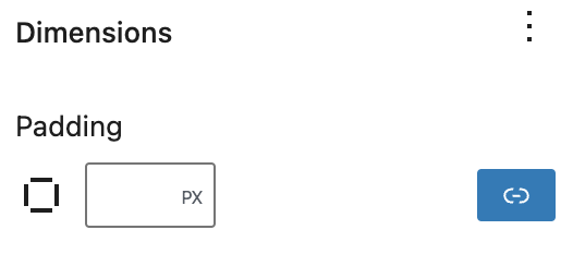
You can change the unit for Padding by clicking on PX to display a dropdown with the other supported units- %, EM, REM, VW, and VH.
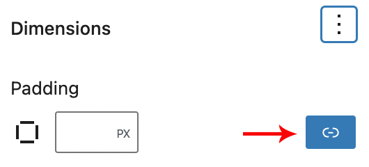
Click the Link icon to the right, to set different spacing values for top, right, bottom and left.
You can type in a custom value in any of the four text fields. You can also change the unit for padding by clicking on PX to display a dropdown with the other supported units- %, EM, REM, VW, and VH.
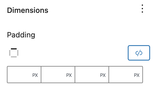
Click on the Link icon once again if you want to have the same value for padding.
Change the height/width of the featured image by typing in a value in the text field for Height/ Width.
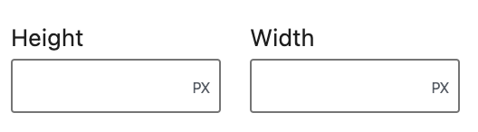
You can also change the unit for height/width by clicking on PX to display a dropdown with the other supported units- %, EM, REM, VW, and VH.
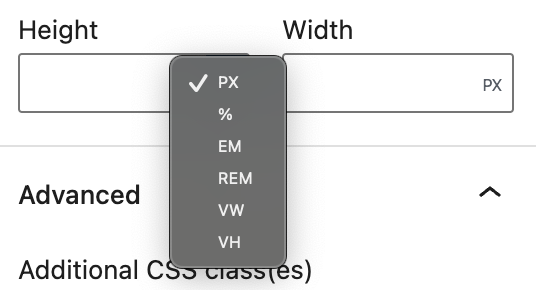
You also have the option to revert all the Dimension changes you made, by clicking on the Reset all option from the dropdown.

Click here to learn more about the Dimensions Settings.
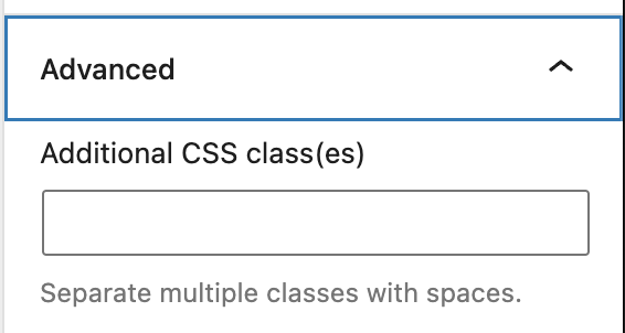
Advanced
The “Advanced” tab lets you add CSS class(es) to your block. This will allow you to write custom CSS and styles to the block.